नए फ़ॉन्ट्स सेक्शन में आपका स्वागत है — यहाँ FFonts.net में जोड़े गए ताज़ा और रचनात्मक फोंट मिलेंगे। चाहे आप डिज़ाइनर हों, डेवलपर हों या टाइपोग्राफी के शौक़ीन, यह पेज आपको ट्रेंड्स से अपडेट रखेगा।
हर नया फ़ॉन्ट अपनी अलग पहचान लाता है — साफ़-सुथरे मॉडर्न सैन्स से लेकर अभिव्यक्तिपूर्ण स्क्रिप्ट और बोल्ड डिस्प्ले स्टाइल तक। हम इस सूची को अक्सर अपडेट करते हैं ताकि आप पहले लाइव प्रीव्यू करें और फिर नि: शुल्क डाउनलोड कर सकें।
-
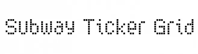
( K-Type - Keith Bates - www.k-type.com/ )
A pixelated, grid-based font with a retro digital display aesthetic.
 डाउनलोड 64 डाउनलोड@WebFont
 -
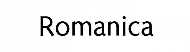
( K-Type - Keith Bates - www.k-type.com/ )
A modern sans-serif font with clean lines and balanced proportions.
![Romanica नि: शुल्क फ़ॉन्ट्स डाउनलोड]() डाउनलोड 308 डाउनलोड@WebFont
डाउनलोड 308 डाउनलोड@WebFont -
( K-Type - Keith Bates - www.k-type.com/ )
A distressed, vintage-style font with a rubber stamp appearance.
![Mailart Rubberstamp Regular नि: शुल्क फ़ॉन्ट्स डाउनलोड]() डाउनलोड 137 डाउनलोड@WebFont
डाउनलोड 137 डाउनलोड@WebFont -
( K-Type - Keith Bates - www.k-type.com/ )
A classic serif font with elegant strokes and balanced medium weight.
![Londinia Medium नि: शुल्क फ़ॉन्ट्स डाउनलोड]() डाउनलोड 209 डाउनलोड@WebFont
डाउनलोड 209 डाउनलोड@WebFont -
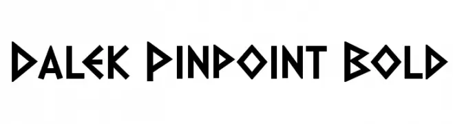
( K-Type - Keith Bates - www.k-type.com/ )
A bold, geometric font with sharp angles and a futuristic aesthetic.
![Dalek Pinpoint Bold नि: शुल्क फ़ॉन्ट्स डाउनलोड]() डाउनलोड 607 डाउनलोड@WebFont
डाउनलोड 607 डाउनलोड@WebFont -
-
( K-Type - Keith Bates - www.k-type.com/ )
A classic serif font with bold uppercase and harmonious lowercase letters.
![Coinage Caps Kruger Gray नि: शुल्क फ़ॉन्ट्स डाउनलोड]() डाउनलोड 409 डाउनलोड@WebFont
डाउनलोड 409 डाउनलोड@WebFont -
( K-Type - Keith Bates - www.k-type.com/ )
A modern, geometric sans-serif font with clean lines and uniform stroke width.
![Banks Miles Single Line नि: शुल्क फ़ॉन्ट्स डाउनलोड]() डाउनलोड 301 डाउनलोड@WebFont
डाउनलोड 301 डाउनलोड@WebFont -
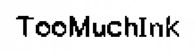
( K Guillory )
A bold, pixelated font with a retro digital style.
![TooMuchInk नि: शुल्क फ़ॉन्ट्स डाउनलोड]() डाउनलोड 37 डाउनलोड@WebFont
डाउनलोड 37 डाउनलोड@WebFont -
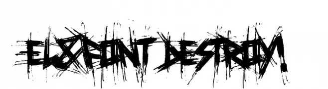
( Jérôme Delage )
A distressed, chaotic font with sharp, jagged edges and a rebellious aesthetic.
![El&Font Destroy! नि: शुल्क फ़ॉन्ट्स डाउनलोड]() डाउनलोड 116 डाउनलोड@WebFont
डाउनलोड 116 डाउनलोड@WebFont -
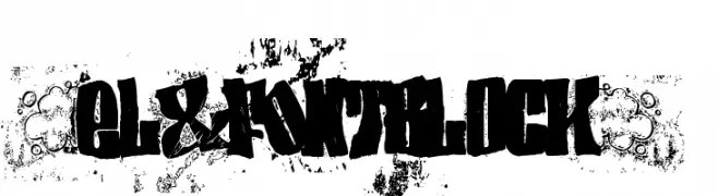
( Jérôme Delage )
A bold, distressed font with a grunge-inspired, textured style.
![(el&font BLOCK) नि: शुल्क फ़ॉन्ट्स डाउनलोड]() डाउनलोड 361 डाउनलोड@WebFont
डाउनलोड 361 डाउनलोड@WebFont


FAQ – नए फ़ॉन्ट्स
आजकल कौन‑सा नया फ़ॉन्ट सबसे ज़्यादा चलन में है?
ट्रेंड जल्दी बदलते हैं, लेकिन इस समय मिनिमल सैन्स‑सेरिफ और अभिव्यक्तिपूर्ण डिस्प्ले फोंट आगे हैं — मोबाइल‑फर्स्ट कंटेंट और मॉडर्न ब्रांडिंग के लिए बेहतरीन।
कौन‑से पाँच नए फ़ॉन्ट्स ज़रूर आज़माएँ?
हाल के पसंदीदा हैं Poppins, Roboto, Montserrat, Open Sans और Lato। ये स्पष्टता और व्यक्तित्व का अच्छा संतुलन देते हैं — टेक ब्रांड्स, एडिटोरियल और सोशल विज़ुअल्स में बढ़िया लगते हैं।
डाउनलोड से पहले कैसे जाँचें?
लाइव प्रीव्यू का उपयोग करें: फ़ॉन्ट पेज पर अपना टेक्स्ट टाइप करें और वेट, स्पेसिंग व अलग‑अलग साइज़ पर पठनीयता जाँचें। सब ठीक लगे तो TTF/OTF फ़ाइलें डाउनलोड करें।