а§Яа•Й৙ а§Ђа§Ља•Й৮а•На§Яа•На§Є а§Єа•За§Ха•Н৴৮ а§Ѓа•За§В а§Ж৙а§Ха§Њ а§Єа•Н৵ৌа§Ч১ а§єа•И вАФ а§Ьа§єа§Ња§Б а§≤а•Ла§Х৙а•На§∞ড়ৃ১ৌ а§Фа§∞ а§Ча•Ба§£а§µа§§а•Н১ৌ ৪ৌ৕ а§Ѓа§ња§≤১а•А а§єа•Иа§Ва•§ а§ѓа•З а§єа§Ѓа§Ња§∞а•З а§Єа§Ѓа•Б৶ৌৃ ৶а•Н৵ৌа§∞а§Њ а§За§Є а§Єа§Ња§≤ а§Єа§ђа§Єа•З а§Еа§Іа§ња§Х а§°а§Ња§Й৮а§≤а•Ла§° а§Фа§∞ а§Й৙ৃа•Ла§Ч а§Ха§ња§П а§Ча§П а§Ђа§Ља•Й৮а•На§Яа•На§Є а§єа•Иа§Ва•§ а§≤а•Ла§Ча•Л, ৵а•За§ђ а§ѓа§Њ а§Єа•Л৴а§≤ а§Ха•З а§≤а§ња§П ৙а§Ха•На§Ха•З ৵ড়а§Ха§≤а•Н৙ а§Ъа§Ња§єа§ња§П? а§ѓа§єа•Аа§В а§Єа•З ৴а•Ба§∞а•В а§Ха§∞а•За§Ва•§
а§єа§∞ а§Яа•Й৙ а§Ђа§Ља•Й৮а•На§Я а§Єа§В১а•Ба§≤৮, ৙৆৮а•Аৃ১ৌ а§Фа§∞ а§ђа§єа•Ба§Й৙ৃа•Ла§Чড়১ৌ а§Ха•З а§≤а§ња§П а§Ьৌ৮ৌ а§Ьৌ১ৌ а§єа•Иа•§ а§ѓа§єа§Ња§Б а§Ѓа•Йа§°а§∞а•Н৮ а§Єа•И৮а•На§Є, а§Па§≤а•Аа§Ча•За§Ва§Я а§Єа•На§Ха•На§∞ড়৙а•На§Я, ৵ড়а§Ва§Яа•За§Ь а§Єа•За§∞а§ња§Ђа§Љ а§Фа§∞ ুড়৮ড়ুа§≤ а§°а§ња§Єа•Н৙а•На§≤а•З вАФ а§Єа§ђ а§Ѓа§ња§≤а•За§Ва§Ча•За•§
-
( Free for a personal use. For a commercial use please visit www.kevinandamanda.com )
A playful handwritten script font with flowing, connected letters and whimsical flair.
 а§°а§Ња§Й৮а§≤а•Ла§° 179 а§°а§Ња§Й৮а§≤а•Ла§°@WebFont
 -
![Quadrats ৮ড়: ৴а•Ба§≤а•На§Х а§Ђа§Ља•Й৮а•На§Яа•На§Є а§°а§Ња§Й৮а§≤а•Ла§°]() а§°а§Ња§Й৮а§≤а•Ла§° 179 а§°а§Ња§Й৮а§≤а•Ла§°@WebFont
а§°а§Ња§Й৮а§≤а•Ла§° 179 а§°а§Ња§Й৮а§≤а•Ла§°@WebFont -
( Fonts by wepfont - Wahyu Eka Prasetya - Personal-use only. For commercial use please contact owner. )
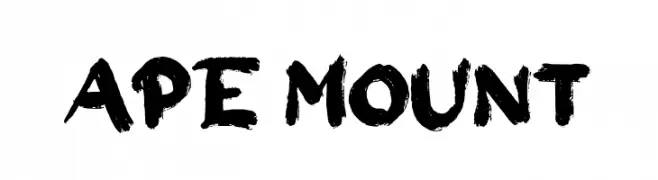
A bold, brush-style font with textured, expressive strokes.
![Ape Mount ৮ড়: ৴а•Ба§≤а•На§Х а§Ђа§Ља•Й৮а•На§Яа•На§Є а§°а§Ња§Й৮а§≤а•Ла§°]() а§°а§Ња§Й৮а§≤а•Ла§° 179 а§°а§Ња§Й৮а§≤а•Ла§°@WebFont
а§°а§Ња§Й৮а§≤а•Ла§° 179 а§°а§Ња§Й৮а§≤а•Ла§°@WebFont -
( Noto is a trademark of Google Inc. Noto fonts are open source. All Noto fonts are published under the SIL Open Font License, Version 1.1 )
A refined, thin serif font with high contrast and a condensed style.
![Noto Serif Display Condensed Thin ৮ড়: ৴а•Ба§≤а•На§Х а§Ђа§Ља•Й৮а•На§Яа•На§Є а§°а§Ња§Й৮а§≤а•Ла§°]() а§°а§Ња§Й৮а§≤а•Ла§° 179 а§°а§Ња§Й৮а§≤а•Ла§°@WebFont
а§°а§Ња§Й৮а§≤а•Ла§° 179 а§°а§Ња§Й৮а§≤а•Ла§°@WebFont -
( Fonts by Sabrcreative - Personal-use only. For commercial use please contact owner. )
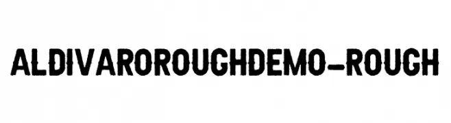
A bold, rough-textured font with a vintage, industrial feel.
![AldivaroRoughDemo-Rough ৮ড়: ৴а•Ба§≤а•На§Х а§Ђа§Ља•Й৮а•На§Яа•На§Є а§°а§Ња§Й৮а§≤а•Ла§°]() а§°а§Ња§Й৮а§≤а•Ла§° 179 а§°а§Ња§Й৮а§≤а•Ла§°@WebFont
а§°а§Ња§Й৮а§≤а•Ла§° 179 а§°а§Ња§Й৮а§≤а•Ла§°@WebFont -
-
( bumbayo.blogspot.com/ )
A playful, hand-drawn font with elongated, irregular characters.
![MahrpedigSans ৮ড়: ৴а•Ба§≤а•На§Х а§Ђа§Ља•Й৮а•На§Яа•На§Є а§°а§Ња§Й৮а§≤а•Ла§°]() а§°а§Ња§Й৮а§≤а•Ла§° 179 а§°а§Ња§Й৮а§≤а•Ла§°@WebFont
а§°а§Ња§Й৮а§≤а•Ла§° 179 а§°а§Ња§Й৮а§≤а•Ла§°@WebFont -
( Fonts by Rokas Cicenas - www.roci.lt )
A modern, high-contrast font with elongated, vertical characters.
![Kurkku ৮ড়: ৴а•Ба§≤а•На§Х а§Ђа§Ља•Й৮а•На§Яа•На§Є а§°а§Ња§Й৮а§≤а•Ла§°]() а§°а§Ња§Й৮а§≤а•Ла§° 179 а§°а§Ња§Й৮а§≤а•Ла§°@WebFont
а§°а§Ња§Й৮а§≤а•Ла§° 179 а§°а§Ња§Й৮а§≤а•Ла§°@WebFont -
( qrealib.ultra-book.com/ )
A playful, organic font with rounded, fluid characters and varying stroke thickness.
![aqualib ৮ড়: ৴а•Ба§≤а•На§Х а§Ђа§Ља•Й৮а•На§Яа•На§Є а§°а§Ња§Й৮а§≤а•Ла§°]() а§°а§Ња§Й৮а§≤а•Ла§° 179 а§°а§Ња§Й৮а§≤а•Ла§°@WebFont
а§°а§Ња§Й৮а§≤а•Ла§° 179 а§°а§Ња§Й৮а§≤а•Ла§°@WebFont -
( Fonts by Des Gomez )
A bold, playful handwritten font with dynamic strokes and whimsical embellishments.
![LifesTooFast ৮ড়: ৴а•Ба§≤а•На§Х а§Ђа§Ља•Й৮а•На§Яа•На§Є а§°а§Ња§Й৮а§≤а•Ла§°]() а§°а§Ња§Й৮а§≤а•Ла§° 179 а§°а§Ња§Й৮а§≤а•Ла§°@WebFont
а§°а§Ња§Й৮а§≤а•Ла§° 179 а§°а§Ња§Й৮а§≤а•Ла§°@WebFont -
![Oligarch ৮ড়: ৴а•Ба§≤а•На§Х а§Ђа§Ља•Й৮а•На§Яа•На§Є а§°а§Ња§Й৮а§≤а•Ла§°]() а§°а§Ња§Й৮а§≤а•Ла§° 179 а§°а§Ња§Й৮а§≤а•Ла§°@WebFont
а§°а§Ња§Й৮а§≤а•Ла§° 179 а§°а§Ња§Й৮а§≤а•Ла§°@WebFont


а§Еа§≠а•А а§Єа§ђа§Єа•З а§≤а•Ла§Х৙а•На§∞а§ња§ѓ а§Ђа§Ља•Й৮а•На§Яа•На§Є а§Ха•М৮вАСа§Єа•З а§єа•Иа§В?
а§°а§ња§Ьа§Ља§Ња§З৮а§∞ Poppins, Roboto, Montserrat, Open Sans а§Фа§∞ Lato а§Ха•Л ৙৪а§В৶ а§Ха§∞১а•З а§єа•Иа§В вАФ а§Єа§Ња§Ђа§Љ а§∞а•В৙ а§Фа§∞ ৵а•Нৃৌ৙а§Х а§Й৙ৃа•Ла§ЧвАСа§Ха•Нৣু১ৌ а§Ха•З а§Ха§Ња§∞а§£а•§ а§ђа•На§∞а§Ња§Ва§° а§Жа§За§°а•За§Ва§Яа§ња§Яа•А, а§≤а•Иа§Ва§°а§ња§Ва§Ч ৙а•За§Ь а§Фа§∞ ৙а•Ла§Єа•На§Яа§∞ вАФ а§Єа§ђа§Ѓа•За§В а§Й৙ৃа•Ба§Ха•На§§а•§
а§≤а•Ла§Ча•Л а§Ха•З а§≤а§ња§П а§Ха•М৮вАСа§Єа•З а§Ђа§Ља•Й৮а•На§Яа•На§Є а§Ъа§≤১а•З а§єа•Иа§В?
а§Ьа•На§ѓа•Ла§Ѓа•За§Яа•На§∞а§ња§Х а§Єа•И৮а•На§ЄвАСа§Єа•За§∞а§ња§Ђа§Љ (а§Ьа•Иа§Єа•З Poppins, Gotham ৴а•Иа§≤а•А а§Ха•З ৙а§∞ড়৵ৌа§∞) а§Єа§Ња§Ђа§ЉвАСа§Єа•Б৕а§∞а•З, а§Єа•На§Ха•За§≤а•За§ђа§≤ а§ђа•На§∞а§Ња§Ва§°а§ња§Ва§Ч а§Ха•З а§≤а§ња§П а§Жа§Ѓ ৙৪а§В৶ а§єа•Иа§Ва•§ а§Ьа§Ља•Нৃৌ৶ৌ ৵а•На§ѓа§Ха•Н১ড়а§Ч১ а§Па§єа§Єа§Ња§Є а§єа•З১а•Б а§Єа•На§Ха•На§∞ড়৙а•На§Я а§Фа§∞ а§єа•Иа§Ва§°а§∞а§ња§Я৮ а§Єа•На§Яа§Ња§За§≤ ৪৶ৌ৐৺ৌа§∞ а§єа•Иа§Ва•§ а§Ѓа§Ьа§Ља§ђа•В১ а§єа•За§°а§≤а§Ња§З৮ а§Ха•З ৪ৌ৕ ৮а•На§ѓа•Ва§Яа•На§∞а§≤ а§ђа•Йа§°а•А а§Ђа§Ља•Й৮а•На§Я вАФ а§™а§єа§Ъৌ৮ а§Фа§∞ а§Єа§В১а•Ба§≤৮ ৶а•Л৮а•Ла§В ৶а•З১ৌ а§єа•Иа•§
а§Яа•Й৙ а§Єа•Ва§Ъа•А а§Хড়১৮а•А а§ђа§Ња§∞ а§Е৙ৰа•За§Я а§єа•Л১а•А а§єа•И?
৵ৌ৪а•Н১৵ড়а§Х а§°а§Ња§Й৮а§≤а•Ла§° а§Фа§∞ а§Па§Ва§Ча•За§Ьа§Ѓа•За§Ва§Я а§Ха•З а§Жа§Іа§Ња§∞ ৙а§∞ ৮ড়ৃুড়১ а§∞а•В৙ а§Єа•З ১ৌа§Ьа§Ља§Њ а§Ха•А а§Ьৌ১а•А а§єа•Иа•§ ৮а§И а§Єа•На§Яа§Ња§∞ а§Ђа•Ла§Ва§Яа•На§Є а§Ьа§≤а•Н৶а•А а§Ца•Ла§Ь৮а•З а§Ха•З а§≤а§ња§П а§Еа§Ха•На§Єа§∞ а§≤а•Ма§Яа•За§Ва•§
рЯТ° а§Яড়৙: а§За§Є ৙а•За§Ь а§Ха•Л а§ђа•Ба§Ха§Ѓа§Ња§∞а•На§Х а§Ха§∞а•За§В вАФ а§Яа•На§∞а•За§Ва§° ১а•За§Ьа§Ља•А а§Єа•З ৐৶а§≤১а•З а§єа•Иа§В а§Фа§∞ а§Жа§Ь а§Ха•З а§Яа•Й৙ а§Ха§≤ а§Ха•А а§∞а•Аа§ђа•На§∞а§Ња§Ва§°а§ња§Ва§Ч а§Ха•Л ৙а•На§∞а•За§∞ড়১ а§Ха§∞ а§Єа§Х১а•З а§єа•Иа§Ва•§