а§Яа•Й৙ а§Ђа§Ља•Й৮а•На§Яа•На§Є а§Єа•За§Ха•Н৴৮ а§Ѓа•За§В а§Ж৙а§Ха§Њ а§Єа•Н৵ৌа§Ч১ а§єа•И вАФ а§Ьа§єа§Ња§Б а§≤а•Ла§Х৙а•На§∞ড়ৃ১ৌ а§Фа§∞ а§Ча•Ба§£а§µа§§а•Н১ৌ ৪ৌ৕ а§Ѓа§ња§≤১а•А а§єа•Иа§Ва•§ а§ѓа•З а§єа§Ѓа§Ња§∞а•З а§Єа§Ѓа•Б৶ৌৃ ৶а•Н৵ৌа§∞а§Њ а§За§Є а§Єа§Ња§≤ а§Єа§ђа§Єа•З а§Еа§Іа§ња§Х а§°а§Ња§Й৮а§≤а•Ла§° а§Фа§∞ а§Й৙ৃа•Ла§Ч а§Ха§ња§П а§Ча§П а§Ђа§Ља•Й৮а•На§Яа•На§Є а§єа•Иа§Ва•§ а§≤а•Ла§Ча•Л, ৵а•За§ђ а§ѓа§Њ а§Єа•Л৴а§≤ а§Ха•З а§≤а§ња§П ৙а§Ха•На§Ха•З ৵ড়а§Ха§≤а•Н৙ а§Ъа§Ња§єа§ња§П? а§ѓа§єа•Аа§В а§Єа•З ৴а•Ба§∞а•В а§Ха§∞а•За§Ва•§
а§єа§∞ а§Яа•Й৙ а§Ђа§Ља•Й৮а•На§Я а§Єа§В১а•Ба§≤৮, ৙৆৮а•Аৃ১ৌ а§Фа§∞ а§ђа§єа•Ба§Й৙ৃа•Ла§Чড়১ৌ а§Ха•З а§≤а§ња§П а§Ьৌ৮ৌ а§Ьৌ১ৌ а§єа•Иа•§ а§ѓа§єа§Ња§Б а§Ѓа•Йа§°а§∞а•Н৮ а§Єа•И৮а•На§Є, а§Па§≤а•Аа§Ча•За§Ва§Я а§Єа•На§Ха•На§∞ড়৙а•На§Я, ৵ড়а§Ва§Яа•За§Ь а§Єа•За§∞а§ња§Ђа§Љ а§Фа§∞ ুড়৮ড়ুа§≤ а§°а§ња§Єа•Н৙а•На§≤а•З вАФ а§Єа§ђ а§Ѓа§ња§≤а•За§Ва§Ча•За•§
-
( Fonts by Adult Ramblings - Anastacia E. Zittel - Personal-use only. For commercial use please contact owner. )
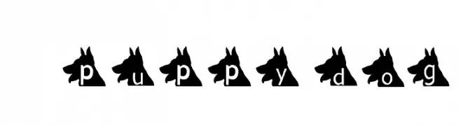
A playful font with letters inside dog head silhouettes, perfect for pet-themed designs.
 а§°а§Ња§Й৮а§≤а•Ла§° 524 а§°а§Ња§Й৮а§≤а•Ла§°@WebFont
 -
![Lynch ৮ড়: ৴а•Ба§≤а•На§Х а§Ђа§Ља•Й৮а•На§Яа•На§Є а§°а§Ња§Й৮а§≤а•Ла§°]() а§°а§Ња§Й৮а§≤а•Ла§° 524 а§°а§Ња§Й৮а§≤а•Ла§°@WebFont
а§°а§Ња§Й৮а§≤а•Ла§° 524 а§°а§Ња§Й৮а§≤а•Ла§°@WebFont -
![Gunfighter Academy Regular ৮ড়: ৴а•Ба§≤а•На§Х а§Ђа§Ља•Й৮а•На§Яа•На§Є а§°а§Ња§Й৮а§≤а•Ла§°]() а§°а§Ња§Й৮а§≤а•Ла§° 524 а§°а§Ња§Й৮а§≤а•Ла§°@WebFont
а§°а§Ња§Й৮а§≤а•Ла§° 524 а§°а§Ња§Й৮а§≤а•Ла§°@WebFont -
( Fonts by Daniel Zadorozny - www.iconian.com )
A futuristic, italicized font with expanded letterforms and angular strokes.
![Space Ranger Expanded Italic ৮ড়: ৴а•Ба§≤а•На§Х а§Ђа§Ља•Й৮а•На§Яа•На§Є а§°а§Ња§Й৮а§≤а•Ла§°]() а§°а§Ња§Й৮а§≤а•Ла§° 524 а§°а§Ња§Й৮а§≤а•Ла§°@WebFont
а§°а§Ња§Й৮а§≤а•Ла§° 524 а§°а§Ња§Й৮а§≤а•Ла§°@WebFont -
( Fonts by deFharo - Fernando Haro - Personal-use only. For commercial use please contact owner. )
A bold, modern font with clean lines and strong visual impact.
![Jane Roe Bold ৮ড়: ৴а•Ба§≤а•На§Х а§Ђа§Ља•Й৮а•На§Яа•На§Є а§°а§Ња§Й৮а§≤а•Ла§°]() а§°а§Ња§Й৮а§≤а•Ла§° 524 а§°а§Ња§Й৮а§≤а•Ла§°@WebFont
а§°а§Ња§Й৮а§≤а•Ла§° 524 а§°а§Ња§Й৮а§≤а•Ла§°@WebFont -
( www.qkila.com/font )
A bold, playful font with thick, rounded edges and a strong outline.
![SOUVENIR ৮ড়: ৴а•Ба§≤а•На§Х а§Ђа§Ља•Й৮а•На§Яа•На§Є а§°а§Ња§Й৮а§≤а•Ла§°]() а§°а§Ња§Й৮а§≤а•Ла§° 524 а§°а§Ња§Й৮а§≤а•Ла§°@WebFont
а§°а§Ња§Й৮а§≤а•Ла§° 524 а§°а§Ња§Й৮а§≤а•Ла§°@WebFont -
( Fonts by Astigmatic One Eye Typographic Institute - Brian J. Bonislawsky - astigmatic.com )
A bold, modern font with a unique horizontal line pattern for a dynamic look.
![Ventilate AOE ৮ড়: ৴а•Ба§≤а•На§Х а§Ђа§Ља•Й৮а•На§Яа•На§Є а§°а§Ња§Й৮а§≤а•Ла§°]() а§°а§Ња§Й৮а§≤а•Ла§° 524 а§°а§Ња§Й৮а§≤а•Ла§°@WebFont
а§°а§Ња§Й৮а§≤а•Ла§° 524 а§°а§Ња§Й৮а§≤а•Ла§°@WebFont -
( Fonts by Nurf Designs - Personal-use only. For commercial use please contact owner. )
A bold, italicized font with a modern, dynamic design and angular edges.
![Spantaran ৮ড়: ৴а•Ба§≤а•На§Х а§Ђа§Ља•Й৮а•На§Яа•На§Є а§°а§Ња§Й৮а§≤а•Ла§°]() а§°а§Ња§Й৮а§≤а•Ла§° 524 а§°а§Ња§Й৮а§≤а•Ла§°@WebFont
а§°а§Ња§Й৮а§≤а•Ла§° 524 а§°а§Ња§Й৮а§≤а•Ла§°@WebFont -
![Margit ৮ড়: ৴а•Ба§≤а•На§Х а§Ђа§Ља•Й৮а•На§Яа•На§Є а§°а§Ња§Й৮а§≤а•Ла§°]() а§°а§Ња§Й৮а§≤а•Ла§° 524 а§°а§Ња§Й৮а§≤а•Ла§°
а§°а§Ња§Й৮а§≤а•Ла§° 524 а§°а§Ња§Й৮а§≤а•Ла§° -
![Jackrabbit's Bar & Grill ৮ড়: ৴а•Ба§≤а•На§Х а§Ђа§Ља•Й৮а•На§Яа•На§Є а§°а§Ња§Й৮а§≤а•Ла§°]() а§°а§Ња§Й৮а§≤а•Ла§° 524 а§°а§Ња§Й৮а§≤а•Ла§°@WebFont
а§°а§Ња§Й৮а§≤а•Ла§° 524 а§°а§Ња§Й৮а§≤а•Ла§°@WebFont -
![Salter Regular ৮ড়: ৴а•Ба§≤а•На§Х а§Ђа§Ља•Й৮а•На§Яа•На§Є а§°а§Ња§Й৮а§≤а•Ла§°]() а§°а§Ња§Й৮а§≤а•Ла§° 524 а§°а§Ња§Й৮а§≤а•Ла§°
а§°а§Ња§Й৮а§≤а•Ла§° 524 а§°а§Ња§Й৮а§≤а•Ла§° -
( Fonts by Maelle.K - Thomas Boucherie )
A modern, elegant serif font with high contrast and artistic flair.
![LA CHAMBRE 77 ৮ড়: ৴а•Ба§≤а•На§Х а§Ђа§Ља•Й৮а•На§Яа•На§Є а§°а§Ња§Й৮а§≤а•Ла§°]() а§°а§Ња§Й৮а§≤а•Ла§° 524 а§°а§Ња§Й৮а§≤а•Ла§°@WebFont
а§°а§Ња§Й৮а§≤а•Ла§° 524 а§°а§Ња§Й৮а§≤а•Ла§°@WebFont -
( Font by kingthingsfonts.co.uk )
A decorative font with medieval influences and angular serifs.
![Kingthings Petrock Light ৮ড়: ৴а•Ба§≤а•На§Х а§Ђа§Ља•Й৮а•На§Яа•На§Є а§°а§Ња§Й৮а§≤а•Ла§°]() а§°а§Ња§Й৮а§≤а•Ла§° 524 а§°а§Ња§Й৮а§≤а•Ла§°@WebFont
а§°а§Ња§Й৮а§≤а•Ла§° 524 а§°а§Ња§Й৮а§≤а•Ла§°@WebFont -
( Fonts by Style-7 - www.styleseven.com - Personal-use only. For commercial use please contact owner. )
A pixelated, retro-style font with a blocky, digital appearance.
![Thin Pixel-7 ৮ড়: ৴а•Ба§≤а•На§Х а§Ђа§Ља•Й৮а•На§Яа•На§Є а§°а§Ња§Й৮а§≤а•Ла§°]() а§°а§Ња§Й৮а§≤а•Ла§° 524 а§°а§Ња§Й৮а§≤а•Ла§°@WebFont
а§°а§Ња§Й৮а§≤а•Ла§° 524 а§°а§Ња§Й৮а§≤а•Ла§°@WebFont -
( Fonts by Woodcutter - woodcutter Manero - Personal-use only. For commercial use please contact owner. )
Playful Hawaiian-themed icon set in bold silhouette style.
![Hawaiian Icons ৮ড়: ৴а•Ба§≤а•На§Х а§Ђа§Ља•Й৮а•На§Яа•На§Є а§°а§Ња§Й৮а§≤а•Ла§°]() а§°а§Ња§Й৮а§≤а•Ла§° 524 а§°а§Ња§Й৮а§≤а•Ла§°@WebFont
а§°а§Ња§Й৮а§≤а•Ла§° 524 а§°а§Ња§Й৮а§≤а•Ла§°@WebFont -
( Fonts by Walter E Stewart )
A bold, distressed font with a rugged, pirate-inspired aesthetic.
![Convincing Pirate ৮ড়: ৴а•Ба§≤а•На§Х а§Ђа§Ља•Й৮а•На§Яа•На§Є а§°а§Ња§Й৮а§≤а•Ла§°]() а§°а§Ња§Й৮а§≤а•Ла§° 524 а§°а§Ња§Й৮а§≤а•Ла§°@WebFont
а§°а§Ња§Й৮а§≤а•Ла§° 524 а§°а§Ња§Й৮а§≤а•Ла§°@WebFont -
![RamRod ৮ড়: ৴а•Ба§≤а•На§Х а§Ђа§Ља•Й৮а•На§Яа•На§Є а§°а§Ња§Й৮а§≤а•Ла§°]() а§°а§Ња§Й৮а§≤а•Ла§° 524 а§°а§Ња§Й৮а§≤а•Ла§°@WebFont
а§°а§Ња§Й৮а§≤а•Ла§° 524 а§°а§Ња§Й৮а§≤а•Ла§°@WebFont -
( Fonts by www.theboutons.com - Gary David Bouton )
Intricate decorative elements inspired by Nouveau, Rococo, and Deco styles.
![Nouveau Rococo Deco Dings I ৮ড়: ৴а•Ба§≤а•На§Х а§Ђа§Ља•Й৮а•На§Яа•На§Є а§°а§Ња§Й৮а§≤а•Ла§°]() а§°а§Ња§Й৮а§≤а•Ла§° 524 а§°а§Ња§Й৮а§≤а•Ла§°@WebFont
а§°а§Ња§Й৮а§≤а•Ла§° 524 а§°а§Ња§Й৮а§≤а•Ла§°@WebFont -
( Fonts by Din Studio - Donis Miftahudin - Personal-use only. For commercial use please contact owner. )
A bold, modern font with a condensed and impactful design.
![Moonlite Solid Personal Use ৮ড়: ৴а•Ба§≤а•На§Х а§Ђа§Ља•Й৮а•На§Яа•На§Є а§°а§Ња§Й৮а§≤а•Ла§°]() а§°а§Ња§Й৮а§≤а•Ла§° 524 а§°а§Ња§Й৮а§≤а•Ла§°@WebFont
а§°а§Ња§Й৮а§≤а•Ла§° 524 а§°а§Ња§Й৮а§≤а•Ла§°@WebFont -
( Fonts by Vladimir Nikolic - www.creativefabrica.com/designer/vladimirnikolic/ - Personal-use only. For commercial use please contact owner. )
A bold, decorative font with a 3D shadow effect and dotted texture.
![Safran Regular ৮ড়: ৴а•Ба§≤а•На§Х а§Ђа§Ља•Й৮а•На§Яа•На§Є а§°а§Ња§Й৮а§≤а•Ла§°]() а§°а§Ња§Й৮а§≤а•Ла§° 524 а§°а§Ња§Й৮а§≤а•Ла§°@WebFont
а§°а§Ња§Й৮а§≤а•Ла§° 524 а§°а§Ња§Й৮а§≤а•Ла§°@WebFont -
( Fonts by Galdino Otten Fonts - www.galdinootten.com - Personal-use only. For commercial use please contact owner. )
A bold, distressed font with a textured, weathered appearance.
![Texture Road ৮ড়: ৴а•Ба§≤а•На§Х а§Ђа§Ља•Й৮а•На§Яа•На§Є а§°а§Ња§Й৮а§≤а•Ла§°]() а§°а§Ња§Й৮а§≤а•Ла§° 524 а§°а§Ња§Й৮а§≤а•Ла§°@WebFont
а§°а§Ња§Й৮а§≤а•Ла§° 524 а§°а§Ња§Й৮а§≤а•Ла§°@WebFont -
![Iwona-BoldItalic ৮ড়: ৴а•Ба§≤а•На§Х а§Ђа§Ља•Й৮а•На§Яа•На§Є а§°а§Ња§Й৮а§≤а•Ла§°]() а§°а§Ња§Й৮а§≤а•Ла§° 524 а§°а§Ња§Й৮а§≤а•Ла§°@WebFont
а§°а§Ња§Й৮а§≤а•Ла§° 524 а§°а§Ња§Й৮а§≤а•Ла§°@WebFont -
( Fonts by Manfred Klein. Free for private and charity use. Free for commercial with donation to organizations )
Whimsical, abstract dingbat font with faces, eyes, and geometric motifs.
![CloseUp ৮ড়: ৴а•Ба§≤а•На§Х а§Ђа§Ља•Й৮а•На§Яа•На§Є а§°а§Ња§Й৮а§≤а•Ла§°]() а§°а§Ња§Й৮а§≤а•Ла§° 524 а§°а§Ња§Й৮а§≤а•Ла§°@WebFont
а§°а§Ња§Й৮а§≤а•Ла§° 524 а§°а§Ња§Й৮а§≤а•Ла§°@WebFont -
( Fonts by Bobistheowl - Personal-use only. For commercial use please contact owner. )
A bold, decorative font with a three-dimensional shadow effect and prominent serifs.
![Cabbagetown ৮ড়: ৴а•Ба§≤а•На§Х а§Ђа§Ља•Й৮а•На§Яа•На§Є а§°а§Ња§Й৮а§≤а•Ла§°]() а§°а§Ња§Й৮а§≤а•Ла§° 523 а§°а§Ња§Й৮а§≤а•Ла§°@WebFont
а§°а§Ња§Й৮а§≤а•Ла§° 523 а§°а§Ња§Й৮а§≤а•Ла§°@WebFont -
![2Toon2 Italic ৮ড়: ৴а•Ба§≤а•На§Х а§Ђа§Ља•Й৮а•На§Яа•На§Є а§°а§Ња§Й৮а§≤а•Ла§°]() а§°а§Ња§Й৮а§≤а•Ла§° 523 а§°а§Ња§Й৮а§≤а•Ла§°@WebFont
а§°а§Ња§Й৮а§≤а•Ла§° 523 а§°а§Ња§Й৮а§≤а•Ла§°@WebFont -
( Fonts by www.fontscafe.com )
A bold, decorative font with a hand-drawn, vintage collegiate style.
![Universal College draft_DEMO ৮ড়: ৴а•Ба§≤а•На§Х а§Ђа§Ља•Й৮а•На§Яа•На§Є а§°а§Ња§Й৮а§≤а•Ла§°]() а§°а§Ња§Й৮а§≤а•Ла§° 523 а§°а§Ња§Й৮а§≤а•Ла§°@WebFont
а§°а§Ња§Й৮а§≤а•Ла§° 523 а§°а§Ња§Й৮а§≤а•Ла§°@WebFont -
![Spaceport One Medium ৮ড়: ৴а•Ба§≤а•На§Х а§Ђа§Ља•Й৮а•На§Яа•На§Є а§°а§Ња§Й৮а§≤а•Ла§°]() а§°а§Ња§Й৮а§≤а•Ла§° 523 а§°а§Ња§Й৮а§≤а•Ла§°@WebFont
а§°а§Ња§Й৮а§≤а•Ла§° 523 а§°а§Ња§Й৮а§≤а•Ла§°@WebFont -
( Fonts by Castcraft Software - opti.netii.net - check the website before use )
A bold, block-like font with thick, uniform characters for impactful design.
![OPTIBuckley-Eight ৮ড়: ৴а•Ба§≤а•На§Х а§Ђа§Ља•Й৮а•На§Яа•На§Є а§°а§Ња§Й৮а§≤а•Ла§°]() а§°а§Ња§Й৮а§≤а•Ла§° 523 а§°а§Ња§Й৮а§≤а•Ла§°@WebFont
а§°а§Ња§Й৮а§≤а•Ла§° 523 а§°а§Ња§Й৮а§≤а•Ла§°@WebFont -
![A Scratched Remix ৮ড়: ৴а•Ба§≤а•На§Х а§Ђа§Ља•Й৮а•На§Яа•На§Є а§°а§Ња§Й৮а§≤а•Ла§°]() а§°а§Ња§Й৮а§≤а•Ла§° 523 а§°а§Ња§Й৮а§≤а•Ла§°@WebFont
а§°а§Ња§Й৮а§≤а•Ла§° 523 а§°а§Ња§Й৮а§≤а•Ла§°@WebFont -
![CHICASyMUJERES ৮ড়: ৴а•Ба§≤а•На§Х а§Ђа§Ља•Й৮а•На§Яа•На§Є а§°а§Ња§Й৮а§≤а•Ла§°]() а§°а§Ња§Й৮а§≤а•Ла§° 523 а§°а§Ња§Й৮а§≤а•Ла§°@WebFont
а§°а§Ња§Й৮а§≤а•Ла§° 523 а§°а§Ња§Й৮а§≤а•Ла§°@WebFont -
![Beeb Mode Zero ৮ড়: ৴а•Ба§≤а•На§Х а§Ђа§Ља•Й৮а•На§Яа•На§Є а§°а§Ња§Й৮а§≤а•Ла§°]() а§°а§Ња§Й৮а§≤а•Ла§° 523 а§°а§Ња§Й৮а§≤а•Ла§°@WebFont
а§°а§Ња§Й৮а§≤а•Ла§° 523 а§°а§Ња§Й৮а§≤а•Ла§°@WebFont -
( Fonts by Goldman Sans - https://design.gs.com/d/design-system/foundation/typography/ - Personal-use only. For commercial use please contact owner. )
A modern, clean sans-serif typeface with balanced letterforms and excellent readability.
![Goldman Sans VF App Medium ৮ড়: ৴а•Ба§≤а•На§Х а§Ђа§Ља•Й৮а•На§Яа•На§Є а§°а§Ња§Й৮а§≤а•Ла§°]() а§°а§Ња§Й৮а§≤а•Ла§° 523 а§°а§Ња§Й৮а§≤а•Ла§°@WebFont
а§°а§Ња§Й৮а§≤а•Ла§° 523 а§°а§Ња§Й৮а§≤а•Ла§°@WebFont -
( Fonts by wep )
A playful, bold, hand-drawn font with a whimsical and artistic feel.
![Ceritane ৮ড়: ৴а•Ба§≤а•На§Х а§Ђа§Ља•Й৮а•На§Яа•На§Є а§°а§Ња§Й৮а§≤а•Ла§°]() а§°а§Ња§Й৮а§≤а•Ла§° 523 а§°а§Ња§Й৮а§≤а•Ла§°@WebFont
а§°а§Ња§Й৮а§≤а•Ла§° 523 а§°а§Ња§Й৮а§≤а•Ла§°@WebFont -
( Fonts by Eva Barabas - www.etsy.com/ie/shop/digitaltypefaces - Personal-use only. For commercial use please contact owner. )
A decorative font with intricate tendril-like designs within bold uppercase letters.
![Tendrils ৮ড়: ৴а•Ба§≤а•На§Х а§Ђа§Ља•Й৮а•На§Яа•На§Є а§°а§Ња§Й৮а§≤а•Ла§°]() а§°а§Ња§Й৮а§≤а•Ла§° 523 а§°а§Ња§Й৮а§≤а•Ла§°@WebFont
а§°а§Ња§Й৮а§≤а•Ла§° 523 а§°а§Ња§Й৮а§≤а•Ла§°@WebFont -
( Fonts by Jen Jones )
A playful, handwritten font with rounded, consistent strokes.
![HelloIHeart1 ৮ড়: ৴а•Ба§≤а•На§Х а§Ђа§Ља•Й৮а•На§Яа•На§Є а§°а§Ња§Й৮а§≤а•Ла§°]() а§°а§Ња§Й৮а§≤а•Ла§° 523 а§°а§Ња§Й৮а§≤а•Ла§°@WebFont
а§°а§Ња§Й৮а§≤а•Ла§° 523 а§°а§Ња§Й৮а§≤а•Ла§°@WebFont


а§Еа§≠а•А а§Єа§ђа§Єа•З а§≤а•Ла§Х৙а•На§∞а§ња§ѓ а§Ђа§Ља•Й৮а•На§Яа•На§Є а§Ха•М৮вАСа§Єа•З а§єа•Иа§В?
а§°а§ња§Ьа§Ља§Ња§З৮а§∞ Poppins, Roboto, Montserrat, Open Sans а§Фа§∞ Lato а§Ха•Л ৙৪а§В৶ а§Ха§∞১а•З а§єа•Иа§В вАФ а§Єа§Ња§Ђа§Љ а§∞а•В৙ а§Фа§∞ ৵а•Нৃৌ৙а§Х а§Й৙ৃа•Ла§ЧвАСа§Ха•Нৣু১ৌ а§Ха•З а§Ха§Ња§∞а§£а•§ а§ђа•На§∞а§Ња§Ва§° а§Жа§За§°а•За§Ва§Яа§ња§Яа•А, а§≤а•Иа§Ва§°а§ња§Ва§Ч ৙а•За§Ь а§Фа§∞ ৙а•Ла§Єа•На§Яа§∞ вАФ а§Єа§ђа§Ѓа•За§В а§Й৙ৃа•Ба§Ха•На§§а•§
а§≤а•Ла§Ча•Л а§Ха•З а§≤а§ња§П а§Ха•М৮вАСа§Єа•З а§Ђа§Ља•Й৮а•На§Яа•На§Є а§Ъа§≤১а•З а§єа•Иа§В?
а§Ьа•На§ѓа•Ла§Ѓа•За§Яа•На§∞а§ња§Х а§Єа•И৮а•На§ЄвАСа§Єа•За§∞а§ња§Ђа§Љ (а§Ьа•Иа§Єа•З Poppins, Gotham ৴а•Иа§≤а•А а§Ха•З ৙а§∞ড়৵ৌа§∞) а§Єа§Ња§Ђа§ЉвАСа§Єа•Б৕а§∞а•З, а§Єа•На§Ха•За§≤а•За§ђа§≤ а§ђа•На§∞а§Ња§Ва§°а§ња§Ва§Ч а§Ха•З а§≤а§ња§П а§Жа§Ѓ ৙৪а§В৶ а§єа•Иа§Ва•§ а§Ьа§Ља•Нৃৌ৶ৌ ৵а•На§ѓа§Ха•Н১ড়а§Ч১ а§Па§єа§Єа§Ња§Є а§єа•З১а•Б а§Єа•На§Ха•На§∞ড়৙а•На§Я а§Фа§∞ а§єа•Иа§Ва§°а§∞а§ња§Я৮ а§Єа•На§Яа§Ња§За§≤ ৪৶ৌ৐৺ৌа§∞ а§єа•Иа§Ва•§ а§Ѓа§Ьа§Ља§ђа•В১ а§єа•За§°а§≤а§Ња§З৮ а§Ха•З ৪ৌ৕ ৮а•На§ѓа•Ва§Яа•На§∞а§≤ а§ђа•Йа§°а•А а§Ђа§Ља•Й৮а•На§Я вАФ а§™а§єа§Ъৌ৮ а§Фа§∞ а§Єа§В১а•Ба§≤৮ ৶а•Л৮а•Ла§В ৶а•З১ৌ а§єа•Иа•§
а§Яа•Й৙ а§Єа•Ва§Ъа•А а§Хড়১৮а•А а§ђа§Ња§∞ а§Е৙ৰа•За§Я а§єа•Л১а•А а§єа•И?
৵ৌ৪а•Н১৵ড়а§Х а§°а§Ња§Й৮а§≤а•Ла§° а§Фа§∞ а§Па§Ва§Ча•За§Ьа§Ѓа•За§Ва§Я а§Ха•З а§Жа§Іа§Ња§∞ ৙а§∞ ৮ড়ৃুড়১ а§∞а•В৙ а§Єа•З ১ৌа§Ьа§Ља§Њ а§Ха•А а§Ьৌ১а•А а§єа•Иа•§ ৮а§И а§Єа•На§Яа§Ња§∞ а§Ђа•Ла§Ва§Яа•На§Є а§Ьа§≤а•Н৶а•А а§Ца•Ла§Ь৮а•З а§Ха•З а§≤а§ња§П а§Еа§Ха•На§Єа§∞ а§≤а•Ма§Яа•За§Ва•§
рЯТ° а§Яড়৙: а§За§Є ৙а•За§Ь а§Ха•Л а§ђа•Ба§Ха§Ѓа§Ња§∞а•На§Х а§Ха§∞а•За§В вАФ а§Яа•На§∞а•За§Ва§° ১а•За§Ьа§Ља•А а§Єа•З ৐৶а§≤১а•З а§єа•Иа§В а§Фа§∞ а§Жа§Ь а§Ха•З а§Яа•Й৙ а§Ха§≤ а§Ха•А а§∞а•Аа§ђа•На§∞а§Ња§Ва§°а§ња§Ва§Ч а§Ха•Л ৙а•На§∞а•За§∞ড়১ а§Ха§∞ а§Єа§Х১а•З а§єа•Иа§Ва•§